Category: photography


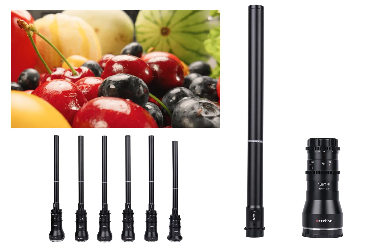
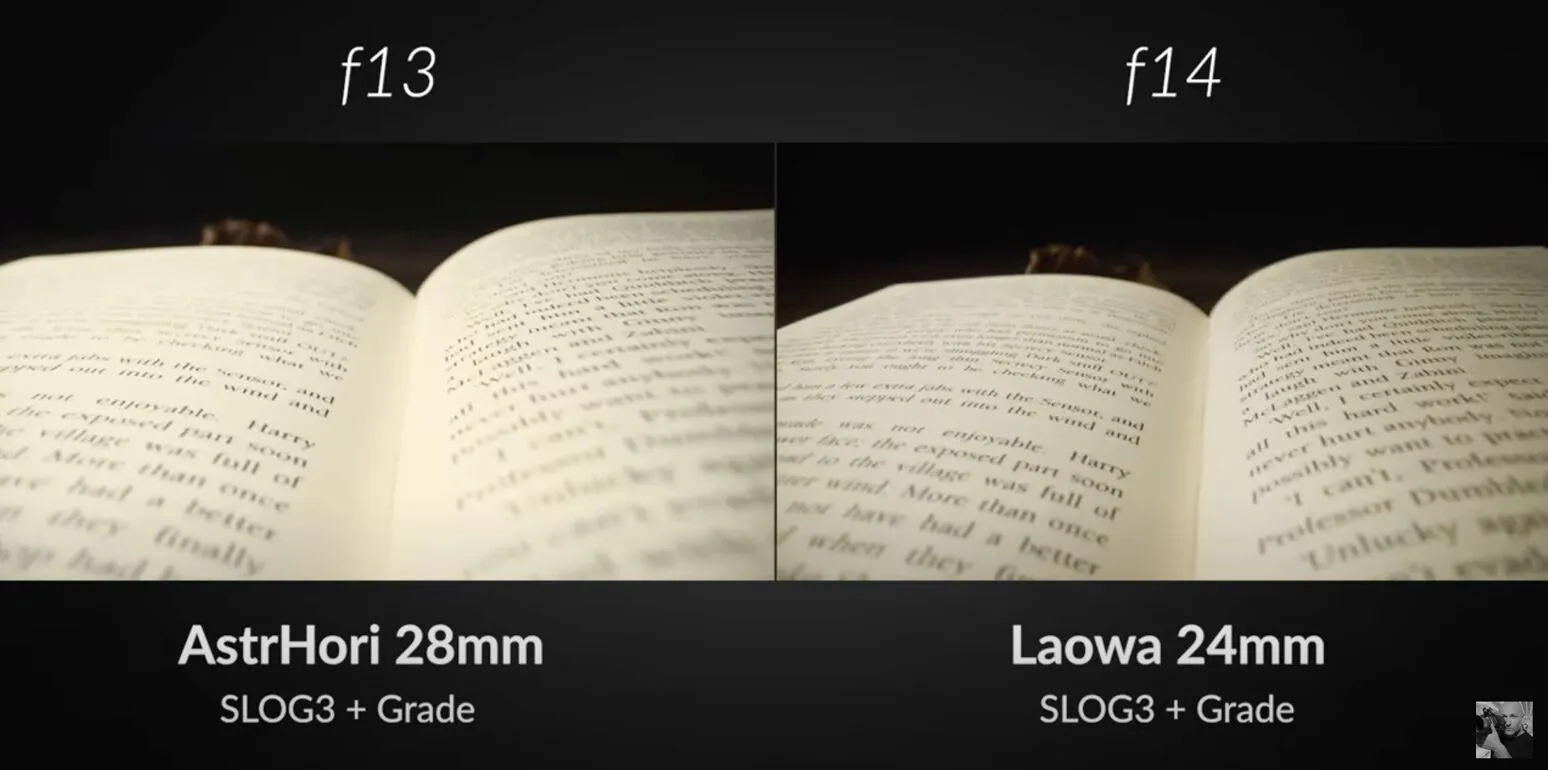
Macro Probe Lens Comparison: AstrHori 28mm vs Laowa 24mm
https://visualeducation.com/macro-probe-lens-comparison-astrhori-28mm-vs-laowa-24mm/
https://petapixel.com/2022/11/01/astrhori-has-a-28mm-macro-probe-lens-that-looks-a-lot-like-laowas/
Overall, the Laowa did perform better than the AstrHori across all of our tests. The AstrHori lost contrast and suffered from flare when the subject was backlit. It also struggled to achieve perfect neutrality in terms of colour balance.
However, as mentioned above, the cost difference between these two lenses is significant. Considering that it costs less than half as much as the Laowa, the AstrHori is an impressive macro probe lens for the price.


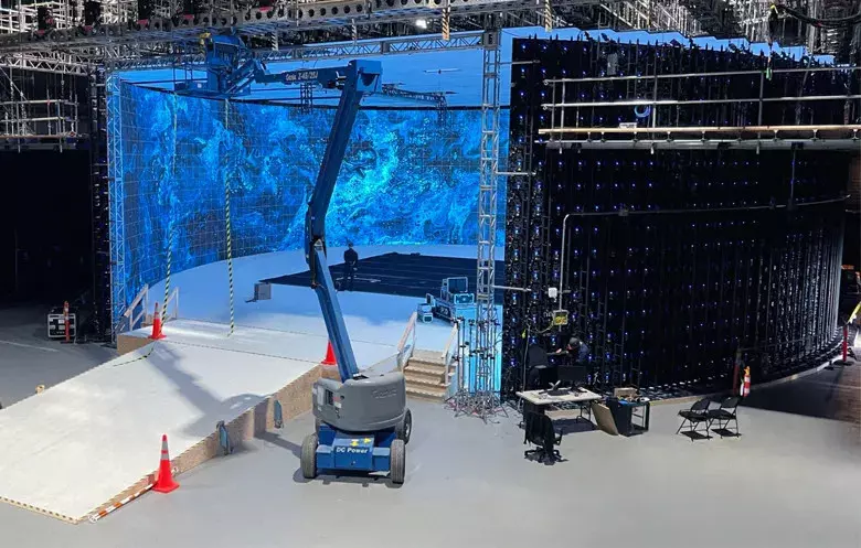
Virtual Production volumes study
Color Fidelity in LED Volumes
https://theasc.com/articles/color-fidelity-in-led-volumes

Virtual Production Glossary
https://vpglossary.com/
What is Virtual Production – In depth analysis
https://www.leadingledtech.com/what-is-a-led-virtual-production-studio-in-depth-technical-analysis/

A comparison of LED panels for use in Virtual Production:
Findings and recommendations
https://eprints.bournemouth.ac.uk/36826/1/LED_Comparison_White_Paper%281%29.pdf


Tobia Montanari – Memory Colors: an essential tool for Colorists
https://www.tobiamontanari.com/memory-colors-an-essential-tool-for-colorists/
“Memory colors are colors that are universally associated with specific objects, elements or scenes in our environment. They are the colors that we expect to see in specific situations: these colors are based on our expectation of how certain objects should look based on our past experiences and memories.
For instance, we associate specific hues, saturation and brightness values with human skintones and a slight variation can significantly affect the way we perceive a scene.
Similarly, we expect blue skies to have a particular hue, green trees to be a specific shade and so on.
Memory colors live inside of our brains and we often impose them onto what we see. By considering them during the grading process, the resulting image will be more visually appealing and won’t distract the viewer from the intended message of the story. Even a slight deviation from memory colors in a movie can create a sense of discordance, ultimately detracting from the viewer’s experience.”