https://techcrunch.com/2025/07/18/netflix-starts-using-genai-in-its-shows-and-films/


3Dprinting (178) A.I. (846) animation (350) blender (210) colour (233) commercials (52) composition (153) cool (364) design (649) Featured (80) hardware (314) IOS (109) jokes (139) lighting (289) modeling (145) music (186) photogrammetry (192) photography (755) production (1291) python (94) quotes (497) reference (314) software (1356) trailers (307) ves (555) VR (221)
https://www.instagram.com/reel/DL5klF-x6O8
My new AI-assisted short film is here. Kira explores human cloning and the search for identity in today’s world.
It took nearly 600 prompts, 12 days (during my free time), and a $500 budget to bring this project to life. The entire film was created by one person using a range of AI tools, all listed at the end.
Enjoy.
~ Hashem

https://variety.com/2025/film/news/trump-tariff-foreign-film-national-security-1236386566
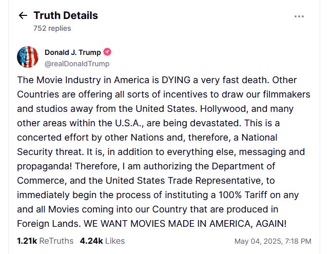
Jon Voight has presented his Hollywood rescue plan…
While President Trump dropped his 100% foreign film tariff bombshell over the weekend, Oscar-winner Jon Voight was already at Mar-a-Lago pitching his industry revival plan. The presidential “Hollywood ambassador” has been making the rounds with unions, studios, and officials to craft his proposal—and now we’ve got the details:
•For filmmakers, Voight proposes stackable federal tax credits (10-20%) on top of existing state incentives. His plan would expand Section 181 provisions, allowing producers to write off 100% of costs in the first year. Instead of blanket tariffs, he suggests targeted penalties of 120% on productions that could have filmed in America but chose foreign locations just for tax incentives.
•For infrastructure, the plan includes tax credits for building or renovating theaters, studios, and post-production facilities. It would create job training programs to ensure Americans have skills for high-paying industry positions, with special emphasis on developing production capabilities in heartland states.
•For streaming platforms, Voight wants to revive regulations that once prevented networks from owning the shows they aired. Streamers would need to pay producers premiums (25-40% of production costs) for exclusive licenses, return more ownership rights after license periods end, and share copyrights 50/50 with content creators.
•For international work, the plan proposes co-production treaties with countries like the UK to enable collaboration without triggering tariffs. It includes exemptions from penalties for legitimate international partnerships that truly require foreign locations.
https://website.ltx.studio/blog/mastering-camera-shots-and-angles
1. Extreme Wide Shot

2. Wide Shot

3. Medium Shot

4. Close Up

5. Extreme Close Up

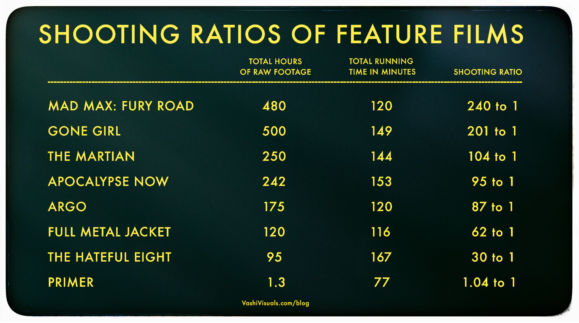
In the Golden Age of Hollywood (1930-1959), a 10:1 shooting ratio was the norm—a 90-minute film meant about 15 hours of footage. Directors like Alfred Hitchcock famously kept it tight with a 3:1 ratio, giving studios little wiggle room in the edit.
Fast forward to today: the digital era has sent shooting ratios skyrocketing. Affordable cameras roll endlessly, capturing multiple takes, resets, and everything in between. Gone are the disciplined “Action to Cut” days of film.
https://en.wikipedia.org/wiki/Shooting_ratio

Narrative voice via Artlistai, News Reporter PlayAI, All other voices are V2V in Elevenlabs.
Powered by (in order of amount) ‘HailuoAI’, ‘KlingAI’ and of course some of our special source. Performance capture by ‘Runway’s Act-One’.
Edited and color graded in ‘DaVinci Resolve’. Composited with ‘After Effects’.
In this film, the ‘Newton’s Cradle’ isn’t just a symbolic object—it represents the fragile balance between control and freedom in a world where time itself is being manipulated. The oscillation of the cradle reflects the constant push and pull of power in this dystopian society. By the end of the film, we discover that this seemingly innocuous object holds the potential to disrupt the system, offering a glimmer of hope that time can be reset and balance restored.
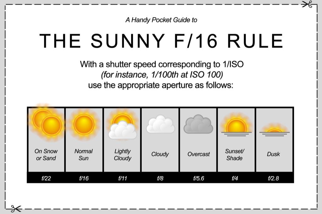
Basic rule
For example, with an ISO of 100, the shutter speed should be 1/100 seconds.

https://curiousrefuge.com/blog/ai-filmmaking-tools-for-filmmakers
https://www.blackmagicdesign.com/ca/products/blackmagiccamera
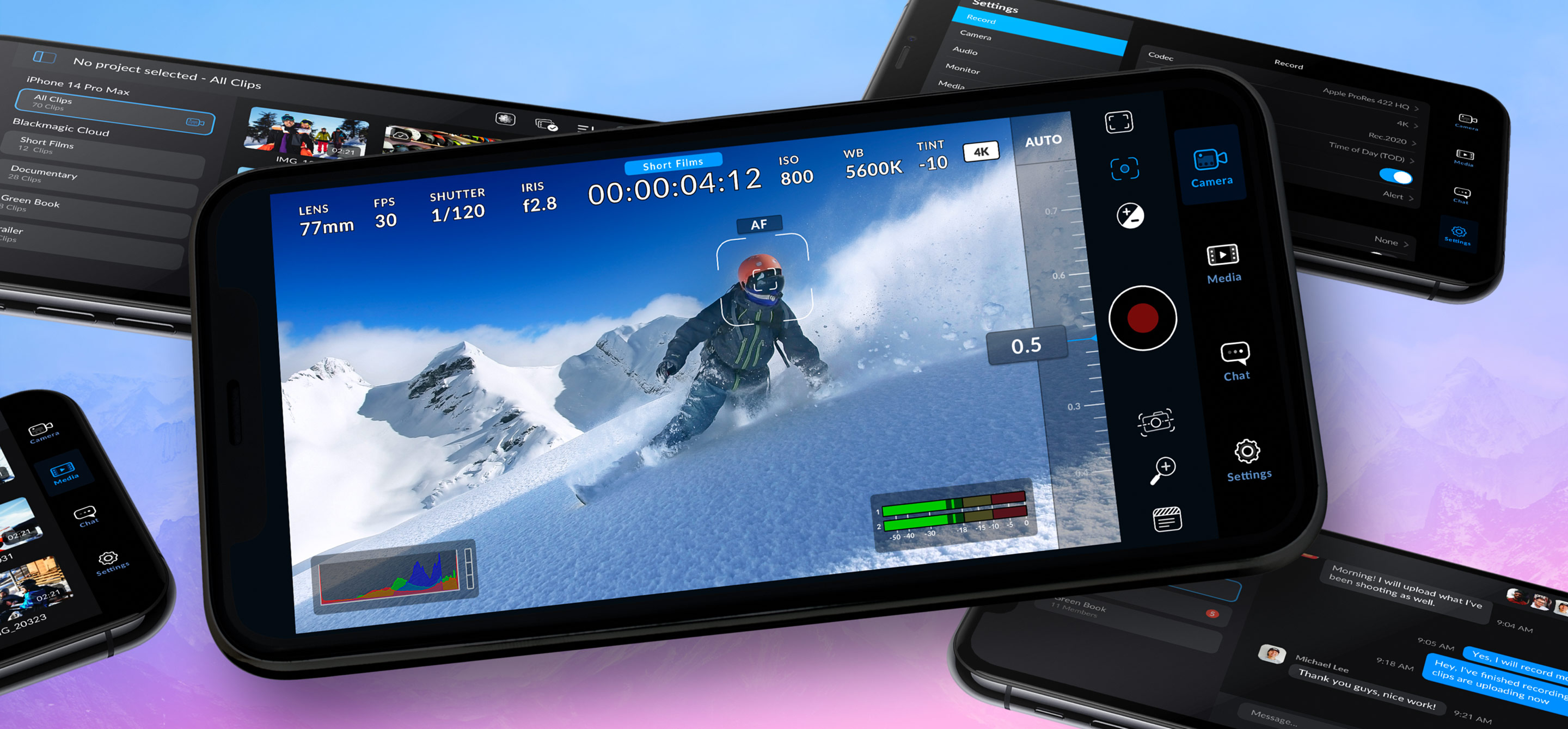
You can adjust settings such as frame rate, shutter angle, white balance and ISO all in a single tap. Or, record directly to Blackmagic Cloud in industry standard 10-bit Apple ProRes files up to 4K! Recording to Blackmagic Cloud Storage lets you collaborate on DaVinci Resolve projects with editors anywhere in the world, all at the same time!
Lucasfilm is winding down operations in Singapore after nearly 20 years in the country, with parent company Disney citing economic factors affecting the industry.
According to an ILM employee in Singapore, there are 340 staff members in the company and work will continue until the end of the year.
95% TRANSPARENCY – 4000NITS BRIGHTNESS – 3.9mm PIXEL PITCH INVISIBLE LED
https://www.onqdigitalgroup.com.au/post/adhesive-transparent-led-film-the-benefits-of-using
COLLECTIONS
| Featured AI
| Design And Composition
| Explore posts
POPULAR SEARCHES
unreal | pipeline | virtual production | free | learn | photoshop | 360 | macro | google | nvidia | resolution | open source | hdri | real-time | photography basics | nuke
FEATURED POSTS
Social Links
DISCLAIMER – Links and images on this website may be protected by the respective owners’ copyright. All data submitted by users through this site shall be treated as freely available to share.