


3Dprinting (178) A.I. (846) animation (350) blender (210) colour (233) commercials (52) composition (153) cool (364) design (649) Featured (80) hardware (314) IOS (109) jokes (139) lighting (289) modeling (145) music (186) photogrammetry (192) photography (755) production (1291) python (94) quotes (497) reference (314) software (1356) trailers (307) ves (555) VR (221)
Category: photography
-
Arto T. – A workflow for creating photorealistic, equirectangular 360° panoramas in ComfyUI using Flux
https://civitai.com/models/735980/flux-equirectangular-360-panorama
https://civitai.com/models/745010?modelVersionId=833115
The trigger phrase is “equirectangular 360 degree panorama”. I would avoid saying “spherical projection” since that tends to result in non-equirectangular spherical images.
Image resolution should always be a 2:1 aspect ratio. 1024 x 512 or 1408 x 704 work quite well and were used in the training data. 2048 x 1024 also works.
I suggest using a weight of 0.5 – 1.5. If you are having issues with the image generating too flat instead of having the necessary spherical distortion, try increasing the weight above 1, though this could negatively impact small details of the image. For Flux guidance, I recommend a value of about 2.5 for realistic scenes.
8-bit output at the moment


-
Finn Jager – From HEIC (High Efficiency Image Container) iPhone to a Multichannel EXR
Finn Jäger has spent some time in making a sleeker tool for all you VFX nerds out there, it takes a HEIC iPhone still and exports a Multichannel EXR – the cool thing is it also converts it to acesCG and it merges the SDR base image with the gain map according to apples math hdr_rgb = sdr_rgb * (1.0 + (headroom – 1.0) * gainmap)
https://github.com/finnschi/heic-shenanigans

-
Mastering Camera Shots and Angles: A Guide for Filmmakers
https://website.ltx.studio/blog/mastering-camera-shots-and-angles
1. Extreme Wide Shot

2. Wide Shot

3. Medium Shot

4. Close Up

5. Extreme Close Up

-
Why the Solar Maximum means peak Northern Lights in 2025
https://northernlightscanada.com/explore/solar-maximum
Every 11 years the Sun’s magnetic pole flips. Leading up to this event, there is a period of increased solar activity — from sunspots and solar flares to spectacular northern and southern lights. The current solar cycle began in 2019 and scientists predict it will peak sometime in 2024 or 2025 before the Sun returns to a lower level of activity in the early 2030s.
The most dramatic events produced by the solar photosphere (the “surface” of the Sun) are coronal mass ejections. When these occur and solar particles get spewed out into space, they can wash over the Earth and interact with our magnetic field. This interaction funnels the charged particles towards Earth’s own North and South magnetic poles — where the particles interact with molecules in Earth’s ionosphere and cause them to fluoresce — phenomena known as aurora borealis (northern lights) and aurora australis (southern lights).
In 2019, it was predicted that the solar maximum would likely occur sometime around July 2025. However, Nature does not have to conform with our predictions, and seems to be giving us the maximum earlier than expected.

Very strong solar activity — especially the coronal mass ejections — can indeed wreak some havoc on our satellite and communication electronics. Most often, it is fairly minor — we get what is known as a “radio blackout” that interferes with some of our radio communications. Once in a while, though, a major solar event occurs. The last of these was in 1859 in what is now known as the Carrington Event, which knocked out telegraph communications across Europe and North America. Should a similar solar storm happen today it would be fairly devastating, affecting major aspects of our infrastructure including our power grid and, (gasp), the internet itself.
-
Camera Metadata Toolkit (camdkit) for Virtual Production
https://github.com/SMPTE/ris-osvp-metadata-camdkit
Today
camdkitsupports mapping (or importing, if you will) of metadata from five popular digital cinema cameras into a canonical form; it also supports a mapping of the metadata defined in the F4 protocol used by tracking system components from Mo-Sys.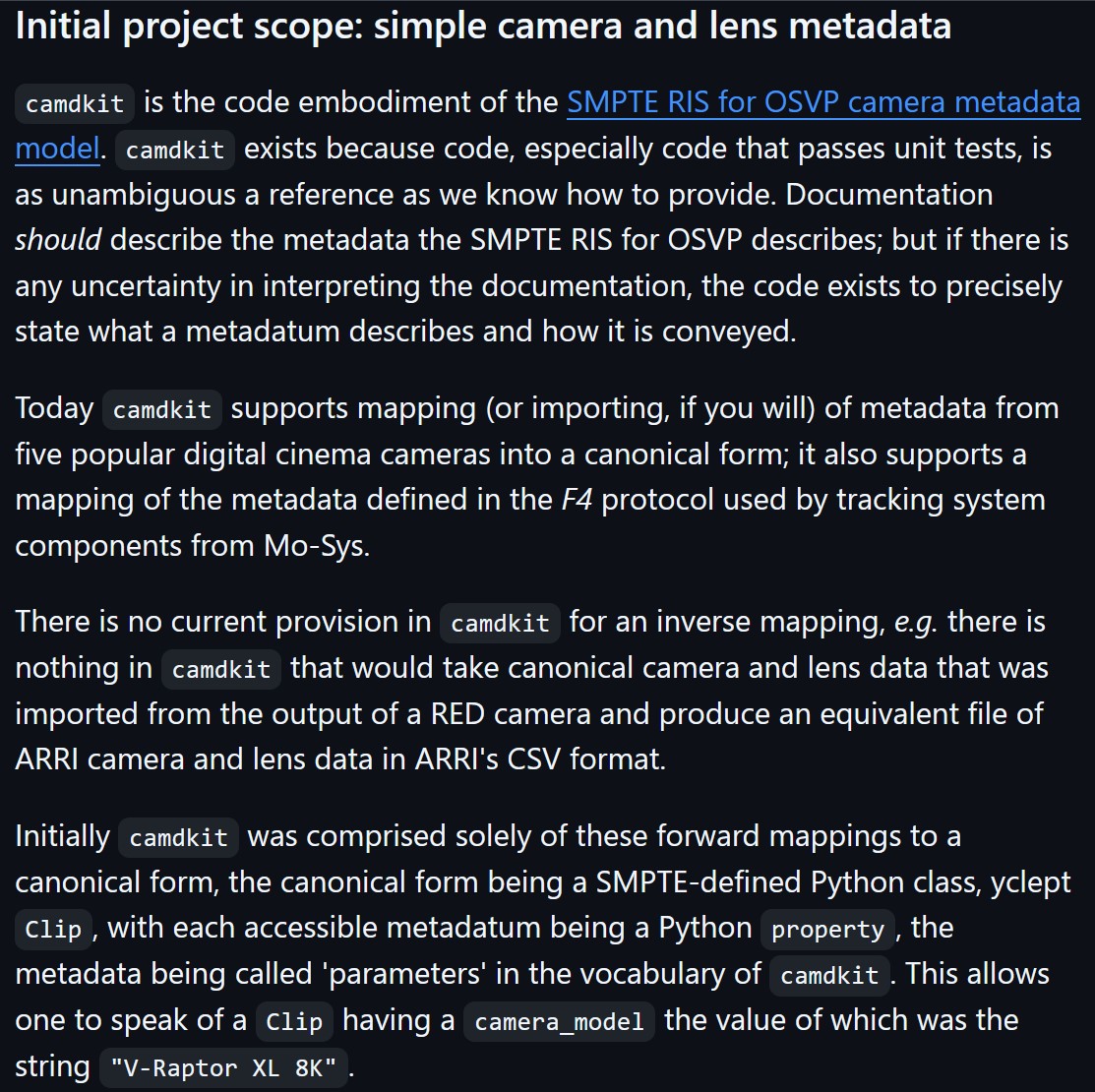
-
SLAM XCAM 8K VR180 3D Camera
8K 30FPS VR180 3D Video | Dual 1/1.5″ CMOS Sensors | 10-bit Color | Snapdragon8 GN2 | Android13 | 6.67″AMOLED|5000mAh |100Mbps Data


-
Debayer – A free command line tool to convert camera raw images into scene-linear exr

https://github.com/jedypod/debayer
The only required dependency is oiiotool. However other “debayer engines” are also supported.
- OpenImageIO – oiiotool is used for converting debayered tif images to exr.
- Debayer Engines
- RawTherapee – Powerful raw development software used to decode raw images. High quality, good selection of debayer algorithms, and more advanced raw processing like chromatic aberration removal.
- LibRaw – dcraw_emu commandline utility included with LibRaw. Optional alternative for debayer. Simple, fast and effective.
- Darktable – Uses darktable-cli plus an xmp config to process.
- vkdt – uses vkdt-cli to debayer. Pretty experimental still. Uses Vulkan for image processing. Stupidly fast. Pretty limited.
-
LibRaw.org – Free interface for extracting data out of RAW images
The LibRaw library provides a simple and unified interface for extracting out of RAW files generated by digital photo cameras the following:
- RAW data (pixel values)
- Metadata necessary for processing RAW (geometry, CFA / Bayer pattern, black level, white balance, etc.)
- Embedded preview / thumbnail.

-
PTGui 13 beta adds control through a Patch Editor
Additions:
- Patch Editor (PTGui Pro)
- DNG output
- Improved RAW / DNG handling
- JPEG 2000 support
- Performance improvements

-
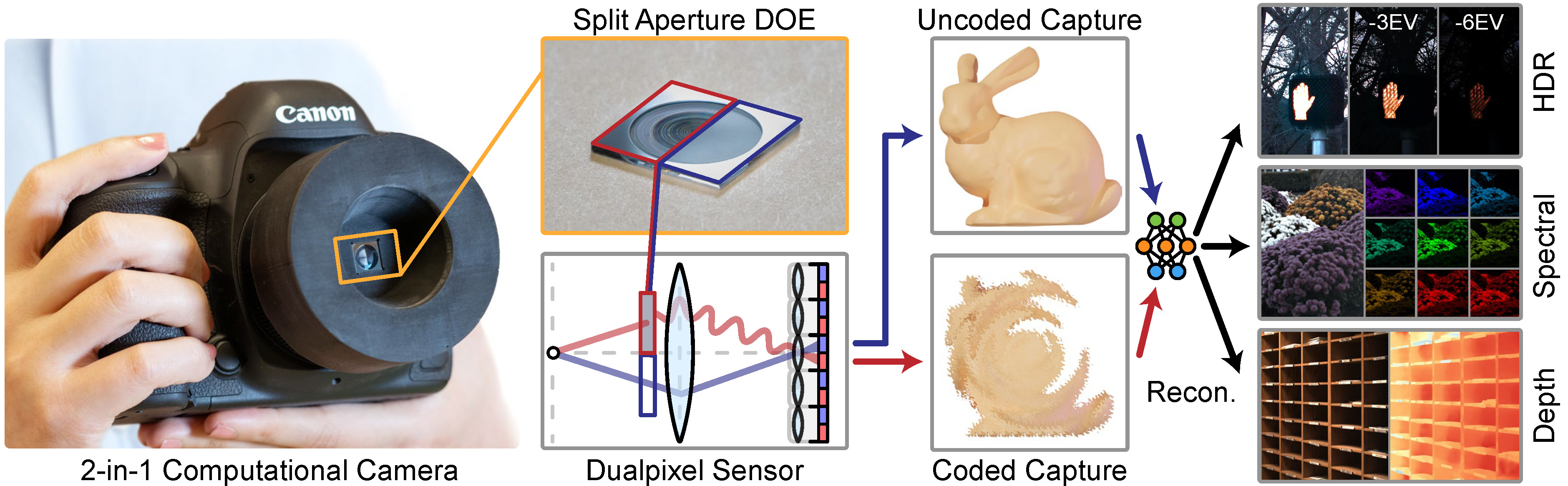
Split-Aperture 2-in-1 Computational Cameras – SIGGRAPH 2024
https://light.princeton.edu/publication/2in1-camera/
“We combine these two optical systems in a single camera by splitting the aperture: one half applies application-specific modulation using a diffractive optical element, and the other captures a conventional image. This co-design with a dual-pixel sensor allows simultaneous capture of coded and uncoded images — without increasing physical or computational footprint.”
-
Christopher Butler – Understanding the Eye-Mind Connection – Vision is a mental process
https://www.chrbutler.com/understanding-the-eye-mind-connection
The intricate relationship between the eyes and the brain, often termed the eye-mind connection, reveals that vision is predominantly a cognitive process. This understanding has profound implications for fields such as design, where capturing and maintaining attention is paramount. This essay delves into the nuances of visual perception, the brain’s role in interpreting visual data, and how this knowledge can be applied to effective design strategies.
This cognitive aspect of vision is evident in phenomena such as optical illusions, where the brain interprets visual information in a way that contradicts physical reality. These illusions underscore that what we “see” is not merely a direct recording of the external world but a constructed experience shaped by cognitive processes.
Understanding the cognitive nature of vision is crucial for effective design. Designers must consider how the brain processes visual information to create compelling and engaging visuals. This involves several key principles:
- Attention and Engagement
- Visual Hierarchy
- Cognitive Load Management
- Context and Meaning


COLLECTIONS
| Featured AI
| Design And Composition
| Explore posts
POPULAR SEARCHES
unreal | pipeline | virtual production | free | learn | photoshop | 360 | macro | google | nvidia | resolution | open source | hdri | real-time | photography basics | nuke
FEATURED POSTS
-
Methods for creating motion blur in Stop motion
-
Advanced Computer Vision with Python OpenCV and Mediapipe
-
Film Production walk-through – pipeline – I want to make a … movie
-
Rec-2020 – TVs new color gamut standard used by Dolby Vision?
-
WhatDreamsCost Spline-Path-Control – Create motion controls for ComfyUI
-
How do LLMs like ChatGPT (Generative Pre-Trained Transformer) work? Explained by Deep-Fake Ryan Gosling
-
Matt Hallett – WAN 2.1 VACE Total Video Control in ComfyUI
-
Kling 1.6 and competitors – advanced tests and comparisons
Social Links
DISCLAIMER – Links and images on this website may be protected by the respective owners’ copyright. All data submitted by users through this site shall be treated as freely available to share.