HDR and Color
/ colour, photography, reference

https://www.soundandvision.com/content/nits-and-bits-hdr-and-color

In HD we often refer to the range of available colors as a color gamut. Such a color gamut is typically plotted on a two-dimensional diagram, called a CIE chart, as shown in at the top of this blog. Each color is characterized by its x/y coordinates.

Good enough for government work, perhaps. But for HDR, with its higher luminance levels and wider color, the gamut becomes three-dimensional.

For HDR the color gamut therefore becomes a characteristic we now call the color volume. It isn’t easy to show color volume on a two-dimensional medium like the printed page or a computer screen, but one method is shown below. As the luminance becomes higher, the picture eventually turns to white. As it becomes darker, it fades to black. The traditional color gamut shown on the CIE chart is simply a slice through this color volume at a selected luminance level, such as 50%.

Three different color volumes—we still refer to them as color gamuts though their third dimension is important—are currently the most significant. The first is BT.709 (sometimes referred to as Rec.709), the color gamut used for pre-UHD/HDR formats, including standard HD.

The largest is known as BT.2020; it encompasses (roughly) the range of colors visible to the human eye (though ET might find it insufficient!).

Between these two is the color gamut used in digital cinema, known as DCI-P3.

sRGB

D65


Light properties
/ lighting, photography, reference

How It Works – Issue 114
https://www.howitworksdaily.com/

Optical illusions help understand how we see
/ photography

Our senses are not fragile otherwise we wouldnt be here…

The brain did not evolve to see the world the way it is but the way it was useful to see it.

Field guide
/ photography, reference

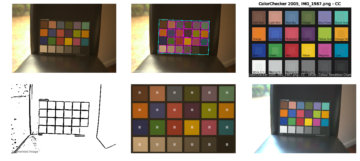
Photography basics: Why Use a (MacBeth) Color Chart?
/ colour, lighting, photography

Start here: http://www.pixelsham.com/2013/05/09/gretagmacbeth-color-checker-numeric-values/


https://www.studiobinder.com/blog/what-is-a-color-checker-tool/


In LightRoom


in Final Cut


in Nuke

Note: In Foundry’s Nuke, the software will map 18% gray to whatever your center f/stop is set to in the viewer settings (f/8 by default… change that to EV by following the instructions below).
You can experiment with this by attaching an Exposure node to a Constant set to 0.18, setting your viewer read-out to Spotmeter, and adjusting the stops in the node up and down. You will see that a full stop up or down will give you the respective next value on the aperture scale (f8, f11, f16 etc.).

One stop doubles or halves the amount or light that hits the filmback/ccd, so everything works in powers of 2.
So starting with 0.18 in your constant, you will see that raising it by a stop will give you .36 as a floating point number (in linear space), while your f/stop will be f/11 and so on.


If you set your center stop to 0 (see below) you will get a relative readout in EVs, where EV 0 again equals 18% constant gray.


In other words. Setting the center f-stop to 0 means that in a neutral plate, the middle gray in the macbeth chart will equal to exposure value 0. EV 0 corresponds to an exposure time of 1 sec and an aperture of f/1.0.


This will set the sun usually around EV12-17 and the sky EV1-4 , depending on cloud coverage.


To switch Foundry’s Nuke’s SpotMeter to return the EV of an image, click on the main viewport, and then press s, this opens the viewer’s properties. Now set the center f-stop to 0 in there. And the SpotMeter in the viewport will change from aperture and fstops to EV.

Composition – cinematography Cheat Sheet

https://moodle.gllm.ac.uk/pluginfile.php/190622/mod_resource/content/1/Cinematography%20Cheat%20Sheet.pdf

Where is our eye attracted first? Why?

Size. Focus. Lighting. Color.

Size. Mr. White (Harvey Keitel) on the right.
Focus. He’s one of the two objects in focus.
Lighting. Mr. White is large and in focus and Mr. Pink (Steve Buscemi) is highlighted by
a shaft of light.
Color. Both are black and white but the read on Mr. White’s shirt now really stands out.


What type of lighting?

-> High key lighting.
Features bright, even illumination and few conspicuous shadows. This lighting key is often used in musicals and comedies.

Low key lighting
Features diffused shadows and atmospheric pools of light. This lighting key is often used in mysteries and thrillers.

High contrast lighting
Features harsh shafts of lights and dramatic streaks of blackness. This type of lighting is often used in tragedies and melodramas.


What type of shot?

Extreme long shot
Taken from a great distance, showing much of the locale. Ifpeople are included in these shots, they usually appear as mere specks

-> Long shot
Corresponds to the space between the audience and the stage in a live theater. The long shots show the characters and some of the locale.

Full shot
Range with just enough space to contain the human body in full. The full shot shows the character and a minimal amount of the locale.

Medium shot
Shows the human figure from the knees or waist up.

Close-Up
Concentrates on a relatively small object and show very little if any locale.

Extreme close-up
Focuses on an unnaturally small portion of an object, giving that part great detail and symbolic significance.


What angle?

Bird’s-eye view.
The shot is photographed directly from above. This type of shot can be disorienting, and the people photographed seem insignificant.

High angle.
This angle reduces the size of the objects photographed. A person photographed from this angle seems harmless and insignificant, but to a lesser extent than with the bird’s-eye view.

-> Eye-level shot.
The clearest view of an object, but seldom intrinsically dramatic, because it tends to be the norm.

Low angle.
This angle increases high and a sense of verticality, heightening the importance of the object photographed. A person shot from this angle is given a sense of power and respect.

Oblique angle.
For this angle, the camera is tilted laterally, giving the image a slanted appearance. Oblique angles suggest tension, transition, a impending movement. They are also called canted or dutch angles.


What is the dominant color?

The use of color in this shot is symbolic. The scene is set in warehouse. Both the set and characters are blues, blacks and whites.

This was intentional allowing for the scenes and shots with blood to have a great level of contrast.


What is the Lens/Filter/Stock?

Telephoto lens.
A lens that draws objects closer but also diminishes the illusion of depth.

Wide-angle lens.
A lens that takes in a broad area and increases the illusion of depth but sometimes distorts the edges of the image.

Fast film stock.
Highly sensitive to light, it can register an image with little illumination. However, the final product tends to be grainy.

Slow film stock.
Relatively insensitive to light, it requires a great deal of illumination. The final product tends to look polished.

The lens is not wide-angle because there isn’t a great sense of depth, nor are several planes in focus. The lens is probably long but not necessarily a telephoto lens because the depth isn’t inordinately compressed.

The stock is fast because of the grainy quality of the image.


Subsidiary Contrast; where does the eye go next?

The two guns.


How much visual information is packed into the image? Is the texture stark, moderate, or highly detailed?

Minimalist clutter in the warehouse allows a focus on a character driven thriller.


What is the Composition?

Horizontal.
Compositions based on horizontal lines seem visually at rest and suggest placidity or peacefulness.

Vertical.
Compositions based on vertical lines seem visually at rest and suggest strength.

-> Diagonal.
Compositions based on diagonal, or oblique, lines seem dynamic and suggest tension or anxiety.

-> Binary. Binary structures emphasize parallelism.

Triangle.
Triadic compositions stress the dynamic interplay among three main

Circle.
Circular compositions suggest security and enclosure.


Is the form open or closed? Does the image suggest a window that arbitrarily isolates a fragment of the scene? Or a proscenium arch, in which the visual elements are carefully arranged and held in balance?

The most nebulous of all the categories of mise en scene, the type of form is determined by how consciously structured the mise en scene is. Open forms stress apparently simple techniques, because with these unself-conscious methods the filmmaker is able to emphasize the immediate, the familiar, the intimate aspects of reality. In open-form images, the frame tends to be deemphasized. In closed form images, all the necessary information is carefully structured within the confines of the frame. Space seems enclosed and self-contained rather than continuous.

Could argue this is a proscenium arch because this is such a classic shot with parallels and juxtapositions.


Is the framing tight or loose? Do the character have no room to move around, or can they move freely without impediments?

Shots where the characters are placed at the edges of the frame and have little room to move around within the frame are considered tight.

Longer shots, in which characters have room to move around within the frame, are considered loose and tend to suggest freedom.

Center-framed giving us the entire scene showing isolation, place and struggle.


Depth of Field. On how many planes is the image composed (how many are in focus)? Does the background or foreground comment in any way on the mid-ground?

Standard DOF, one background and clearly defined foreground.


Which way do the characters look vis-a-vis the camera?

An actor can be photographed in any of five basic positions, each conveying different psychological overtones.

Full-front (facing the camera):
the position with the most intimacy. The character is looking in our direction, inviting our complicity.

Quarter Turn:
the favored position of most filmmakers. This position offers a high degree of intimacy but with less emotional involvement than the full-front.

-> Profile (looking of the frame left or right):
More remote than the quarter turn, the character in profile seems unaware of being observed, lost in his or her own thoughts.

Three-quarter Turn:
More anonymous than the profile, this position is useful for conveying a character’s unfriendly or antisocial feelings, for in effect, the character is partially turning his or her back on us, rejecting our interest.

Back to Camera:
The most anonymous of all positions, this position is often used to suggest a character’s alienation from the world. When a character has his or her back to the camera, we can only guess what’s taking place internally, conveying a sense of concealment, or mystery.

How much space is there between the characters?

Extremely close, for a gunfight.


The way people use space can be divided into four proxemic patterns.

Intimate distances.
The intimate distance ranges from skin contact to about eighteen inches away. This is the distance of physical involvement–of love, comfort, and tenderness between individuals.

-> Personal distances.
The personal distance ranges roughly from eighteen inches away to about four feet away. These distances tend to be reserved for friends and acquaintances. Personal distances preserve the privacy between individuals, yet these rages don’t necessarily suggest exclusion, as intimate distances often do.

Social distances.
The social distance rages from four feet to about twelve feet. These distances are usually reserved for impersonal business and casual social gatherings. It’s a friendly range in most cases, yet somewhat more formal than the personal distance.

Public distances.
The public distance extends from twelve feet to twenty-five feet or more. This range tends to be formal and rather detached.

Photography basics: Depth of Field and composition
/ composition, photography

Depth of field is the range within which focusing is resolved in a photo.
Aperture has a huge affect on to the depth of field.


Changing the f-stops (f/#) of a lens will change aperture and as such the DOF.

f-stops are a just certain number which is telling you the size of the aperture. That’s how f-stop is related to aperture (and DOF).

If you increase f-stops, it will increase DOF, the area in focus (and decrease the aperture). On the other hand, decreasing the f-stop it will decrease DOF (and increase the aperture).

The red cone in the figure is an angular representation of the resolution of the system. Versus the dotted lines, which indicate the aperture coverage. Where the lines of the two cones intersect defines the total range of the depth of field.

This image explains why the longer the depth of field, the greater the range of clarity.