


BREAKING NEWS
LATEST POSTS
-
Niels Cautaerts – Python dependency management is a dumpster fire
https://nielscautaerts.xyz/python-dependency-management-is-a-dumpster-fire.html
For many modern programming languages, the associated tooling has the lock-file based dependency management mechanism baked in. For a great example, consider Rust’s Cargo.
(more…)
Not so with Python.
The default package manager for Python is pip. The default instruction to install a package is to runpip install package. Unfortunately, this imperative approach for creating your environment is entirely divorced from the versioning of your code. You very quickly end up in a situation where you have 100’s of packages installed. You no longer know which packages you explicitly asked to install, and which packages got installed because they were a transitive dependency. You no longer know which version of the code worked in which environment, and there is no way to roll back to an earlier version of your environment. Installing any new package could break your environment.
… -
Meta Avat3r – Large Animatable Gaussian Reconstruction Model for High-fidelity 3D Head Avatars
https://tobias-kirschstein.github.io/avat3r
Avat3r takes 4 input images of a person’s face and generates an animatable 3D head avatar in a single forward pass. The resulting 3D head representation can be animated at interactive rates. The entire creation process of the 3D avatar, from taking 4 smartphone pictures to the final result, can be executed within minutes.
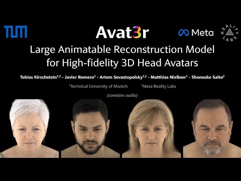
https://www.uploadvr.com/meta-researchers-generate-photorealistic-avatars-from-just-four-selfies
-
Shadow of Mordor’s brilliant Nemesis system is locked away by a Warner Bros patent until 2036, despite studio shutdown
The Nemesis system, for those unfamiliar, is a clever in-game mechanic which tracks a player’s actions to create enemies that feel capable of remembering past encounters. In the studio’s Middle-earth games, this allowed foes to rise through the ranks and enact revenge.
The patent itself – which you can view here – was originally filed back in 2016, before it was granted in 2021. It is dubbed “Nemesis characters, nemesis forts, social vendettas and followers in computer games”. As it stands, the patent has an expiration date of 11th August, 2036.

-
Crypto Mining Attack via ComfyUI/Ultralytics in 2024
https://github.com/ultralytics/ultralytics/issues/18037
zopieux on Dec 5, 2024 : Ultralytics was attacked (or did it on purpose, waiting for a post mortem there), 8.3.41 contains nefarious code downloading and running a crypto miner hosted as a GitHub blob.

-
Walt Disney Animation Abandons Longform Streaming Content
https://www.hollywoodreporter.com/business/business-news/tiana-disney-series-shelved-1236153297
A spokesperson confirmed there will be some layoffs in its Vancouver studio as a result of this shift in business strategy. In addition to the Tiana series, the studio is also scrapping an unannounced feature-length project that was set to go straight to Disney+.
Insiders say that Walt Disney Animation remains committed to releasing one theatrical film per year in addition to other shorts and special projects

-
Andreas Horn – The 9 algorithms
The illustration below highlights the algorithms most frequently utilized in our everyday activities: They play a key role in everything we do from online shopping recommendations, navigation apps, social media, email spam filters and even smart home devices.
🔹 𝗦𝗼𝗿𝘁𝗶𝗻𝗴 𝗔𝗹𝗴𝗼𝗿𝗶𝘁𝗵𝗺
– Organize data for efficiency.
➜ Example: Sorting email threads or search results.
🔹 𝗗𝗶𝗷𝗸𝘀𝘁𝗿𝗮’𝘀 𝗔𝗹𝗴𝗼𝗿𝗶𝘁𝗵𝗺
– Finds the shortest path in networks.
➜ Example: Google Maps driving routes.
🔹 𝗧𝗿𝗮𝗻𝘀𝗳𝗼𝗿𝗺𝗲𝗿𝘀
– AI models that understand context and meaning.
➜ Example: ChatGPT, Claude and other LLMs.
🔹 𝗟𝗶𝗻𝗸 𝗔𝗻𝗮𝗹𝘆𝘀𝗶𝘀
– Ranks pages and builds connections.
➜ Example: TikTok PageRank, LinkedIn recommendations.
🔹 𝗥𝗦𝗔 𝗔𝗹𝗴𝗼𝗿𝗶𝘁𝗵𝗺
– Encrypts and secures data communication.
➜ Example: WhatsApp encryption or online banking.
🔹 𝗜𝗻𝘁𝗲𝗴𝗲𝗿 𝗙𝗮𝗰𝘁𝗼𝗿𝗶𝘇𝗮𝘁𝗶𝗼𝗻
– Secures cryptographic systems.
➜ Example: Protecting sensitive data in blockchain.
🔹 𝗖𝗼𝗻𝘃𝗼𝗹𝘂𝘁𝗶𝗼𝗻𝗮𝗹 𝗡𝗲𝘂𝗿𝗮𝗹 𝗡𝗲𝘁𝘄𝗼𝗿𝗸𝘀 (𝗖𝗡𝗡𝘀)
– Recognizes patterns in images and videos.
➜ Example: Facial recognition, object detection in self-driving cars.
🔹 𝗛𝘂𝗳𝗳𝗺𝗮𝗻 𝗖𝗼𝗱𝗶𝗻𝗴
– Compresses data efficiently.
➜ Example: JPEG and MP3 file compression.
🔹 𝗦𝗲𝗰𝘂𝗿𝗲 𝗛𝗮𝘀𝗵 𝗔𝗹𝗴𝗼𝗿𝗶𝘁𝗵𝗺 (𝗦𝗛𝗔)
– Ensures data integrity.
➜ Example: Password encryption, digital signatures.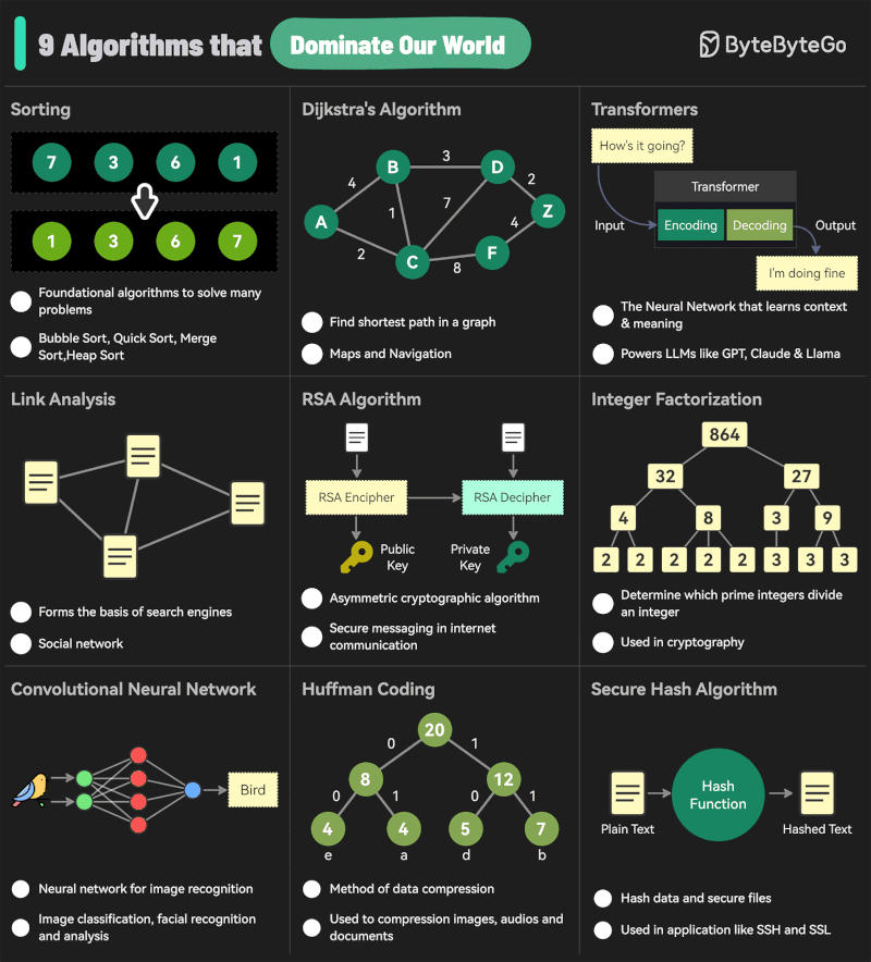
-
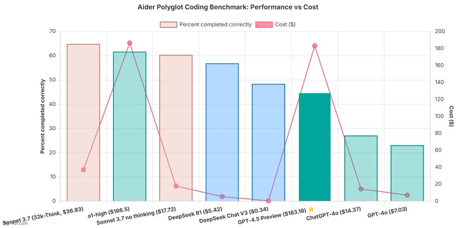
OpenAI 4.5 model arrives to mixed reviews
The verdict is in: OpenAI’s newest and most capable traditional AI model, GPT-4.5, is big, expensive, and slow, providing marginally better performance than GPT-4o at 30x the cost for input and 15x the cost for output. The new model seems to prove that longstanding rumors of diminishing returns in training unsupervised-learning LLMs were correct and that the so-called “scaling laws” cited by many for years have possibly met their natural end.
-
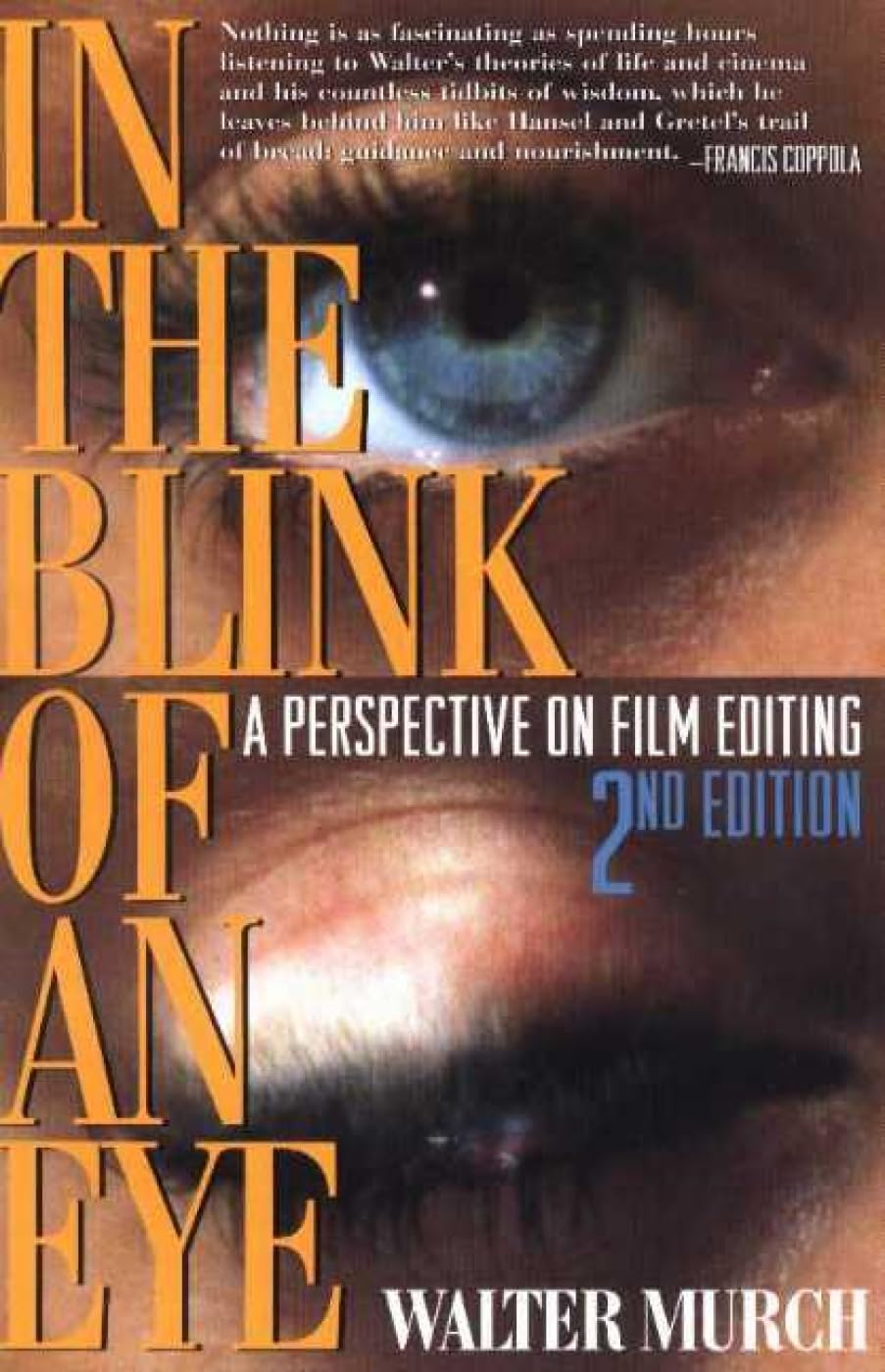
Walter Murch – “In the Blink of an Eye” – A perspective on cut editing
https://www.amazon.ca/Blink-Eye-Revised-2nd/dp/1879505622
Celebrated film editor Walter Murch’s vivid, multifaceted, thought-provoking essay on film editing. Starting with the most basic editing question — Why do cuts work? — Murch takes the reader on a wonderful ride through the aesthetics and practical concerns of cutting film. Along the way, he offers unique insights on such subjects as continuity and discontinuity in editing, dreaming, and reality; criteria for a good cut; the blink of the eye as an emotional cue; digital editing; and much more. In this second edition, Murch revises his popular first edition’s lengthy meditation on digital editing in light of technological changes. Francis Ford Coppola says about this book: “Nothing is as fascinating as spending hours listening to Walter’s theories of life, cinema and the countless tidbits of wisdom that he leaves behind like Hansel and Gretel’s trail of breadcrumbs…….”
Version 1.0.0


FEATURED POSTS


-
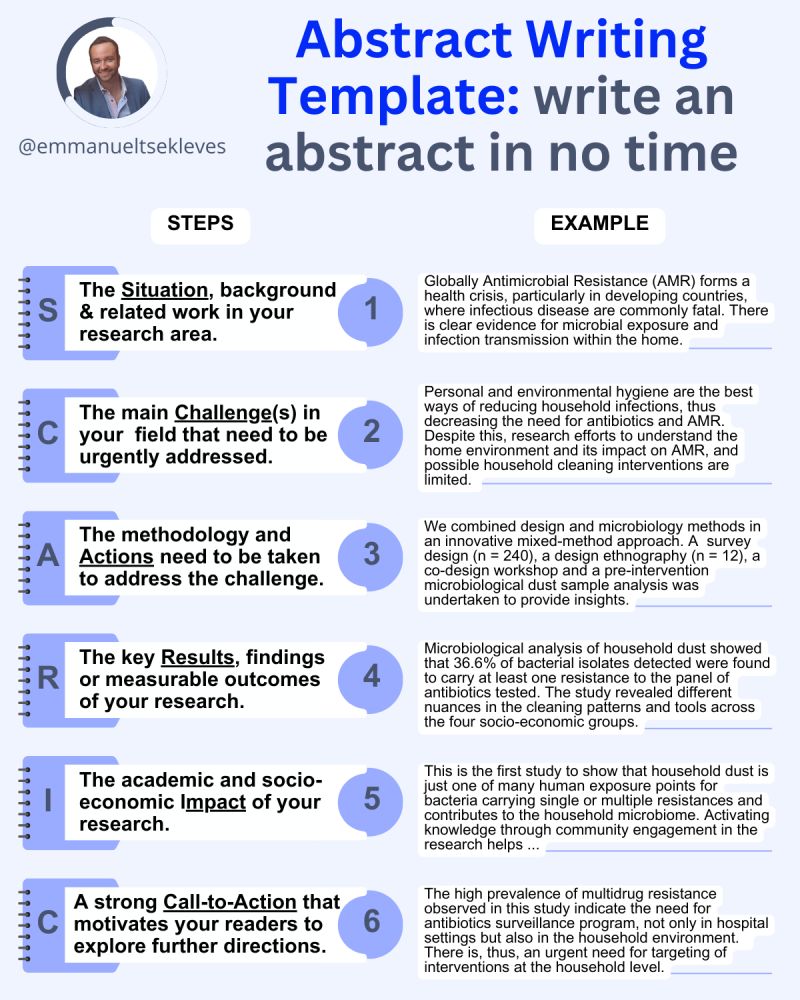
Emmanuel Tsekleves – Writing Research Papers
Here’s the journey of crafting a compelling paper:
1️. ABSTRACT
This is your elevator pitch.
Give a methodology overview.
Paint the problem you’re solving.
Highlight key findings and their impact.
2️. INTRODUCTION
Start with what we know.
Set the stage for our current understanding.
Hook your reader with the relevance of your work.
3️. LITERATURE REVIEW
Identify what’s unknown.
Spot the gaps in current knowledge.
Your job in the next sections is to fill this gap.
4️. METHODOLOGY
What did you do?
Outline how you’ll fill that gap.
Be transparent about your approach.
Make it reproducible so others can follow.
5️. RESULTS
Let the data speak for itself.
Present your findings clearly.
Keep it concise and focused.
6️. DISCUSSION
Now, connect the dots.
Discuss implications and significance.
How do your findings bridge the knowledge gap?
7️. CONCLUSION
Wrap it up with future directions.
What does this mean for us moving forward?
Leave the reader with a call to action or reflection.
8️. REFERENCES
Acknowledge the giants whose shoulders you stand on.
A robust reference list shows the depth of your research.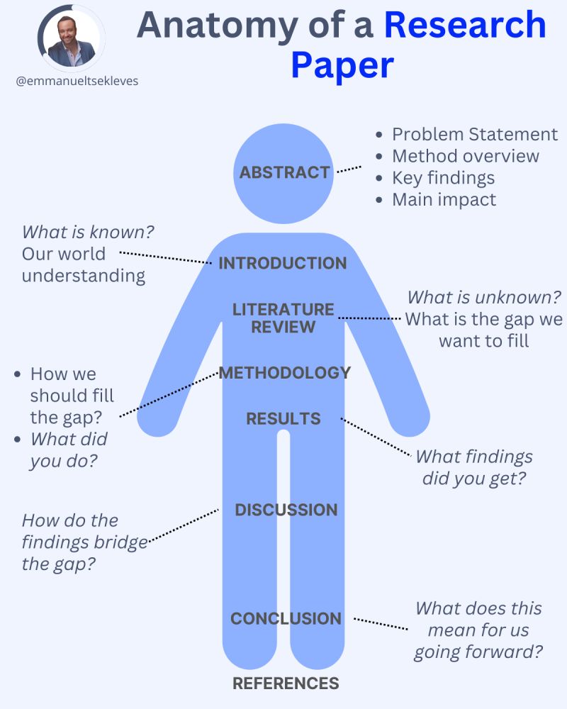
-
Tobia Montanari – Memory Colors: an essential tool for Colorists
https://www.tobiamontanari.com/memory-colors-an-essential-tool-for-colorists/
“Memory colors are colors that are universally associated with specific objects, elements or scenes in our environment. They are the colors that we expect to see in specific situations: these colors are based on our expectation of how certain objects should look based on our past experiences and memories.
For instance, we associate specific hues, saturation and brightness values with human skintones and a slight variation can significantly affect the way we perceive a scene.
Similarly, we expect blue skies to have a particular hue, green trees to be a specific shade and so on.
Memory colors live inside of our brains and we often impose them onto what we see. By considering them during the grading process, the resulting image will be more visually appealing and won’t distract the viewer from the intended message of the story. Even a slight deviation from memory colors in a movie can create a sense of discordance, ultimately detracting from the viewer’s experience.”

